Restaurant + Catering by DESTAPAS
Delicious food, digestible UX
My role
As the sole designer, I worked on this project from end-to-end. I conducted user research, designed prototypes in Figma, implemented designs in Squarespace, wrote content for the website, and administered usability tests.
I collaborated with the two owners of DESTAPAS on this project.
Project proposal
Before DESTAPAS was a restaurant, they were just a catering company. Soon they will have two businesses with similar menus, operating under the same name, and they needed a place online to share information about both businesses.
Design scope
User research and interviews
Data was collected from our survey on restaurant behavior, and 4 individuals were interviewed who have used catering services in the past.
Figma → Squarespace
The first draft was designed in Figma, before realizing Squarespace would be a better option, which would allow the restaurant owners flexibility in the future.
Iterations
The information architecture, color palette and icons were changed several times throughout the project before we landed on the perfect DESTAPAS brand image.
Content writing
We wrote copy that distinguished the two businesses, and added in touches of Spanish to the menu to remain authentic to their Spanish roots.
Old with new
We decided to scrap the old DESTAPAS catering website, and build an entirely fresh one that featured both the catering info, and the restaurant info.
Branding
The two restaurant owners are from Spain, and we wanted the branding of the website to mirror the authentic Spanish food DESTAPAS will serve.
Project Phases
Phase 0
Conduct user research, identify personas, ideate on branding and design ideas.
Phase 1
Merge websites and publish ‘Restaurant Opening Soon” version of website.
Phase 2
Build out DESTAPAS restaurant website with complete restaurant menu.
User research → Personas
Restaurant Persona
The Hungry San Franciscan

This user is likely viewing potential restaurants to visit from their phone

This user is possibly willing to try a new restaurant if it looks appealing

This user would like to know where the restaurant is in San Francisco
Catering Persona
The Occupied Organizer

This user has an event coming up that will need catering

This user has a large to-do list and needs an easy catering solution

This user has a budget allowance for catering
Personas → Design goals
Where is the restaurant?
Through user research we discovered that potential customers want to see the neighborhood of a restaurant along with the address.


Mobile-first design
Additionally, users wanted mobile-friendly, text-based menu pages, because PDFs can be challenging to view on a phone.


Design goals → Branding
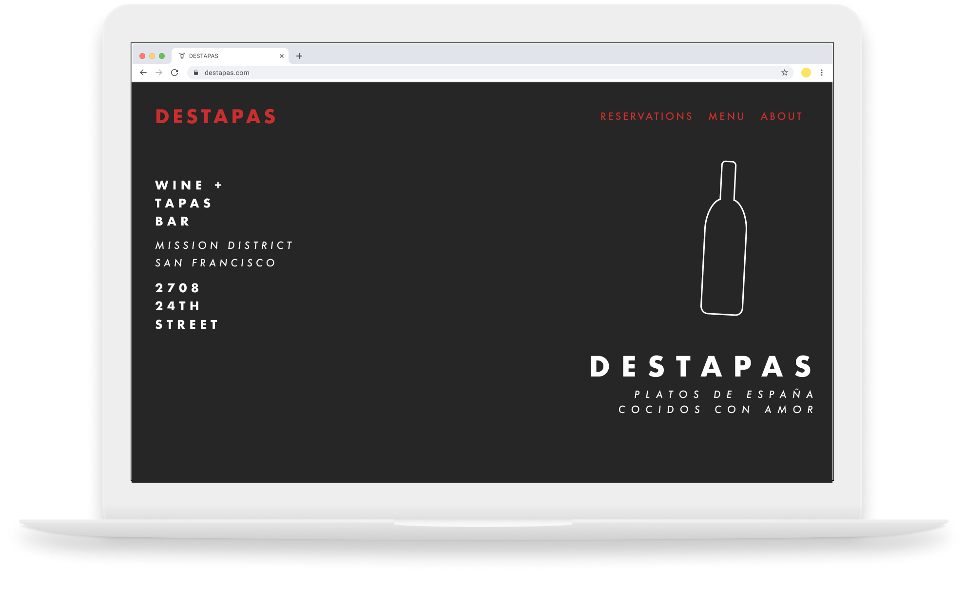
Color palette, version 1
We used a charcoal-colored background because it felt striking and intimate, which is how we want the restaurant to feel. The accents of red and white were used to reference the Spanish roots of the restaurant.
Logo, version 1
The bottle icon was a homage to the Spanish wine they will be serving. It was designed with a slight tilt and with thin lines to give it a comfortable, modern feel.


Changing platforms → Usability tests
Figma to Squarespace
After designing a mockup in Figma, we made the choice to move the project to Squarespace. Using a content management system would allow the restaurant owners to edit on their own. We decided to move the project to Squarespace, and then replicated the Figma designs.
Visual design changes
After we moved to Squarespace we changed the logo, color palette, and background to convey the vibe of a comfortable, cozy, delicious Spanish eatery.

Usability tests for navigation
During usability tests, we found that users struggled to find precise info when different categories of catering information were on separate pages.
We redesigned the information so potential catering clients could navigate to exactly where they want to go.
Catering can be confusing
We had a lot of written content from the original catering website about the process, but during usability tests, we found it wasn’t helpful enough. We created instructions to guide potential catering clients through the process.

Usability tests → Iterations
Branding decisions
We changed the accent color to yellow, because it still felt Spanish without being as serious as red. We also lightened the background so it was easier to read. Additionally, the logo of the bottle did not feel Spanish enough. We collaborated with a logo designer on our new logo, which represents a Spanish bull.
Authentic Spanish imagery
One iteration of our background image featured paella in a pan with a long handle, until we realized that authentic paella is never cooked in a pan with a long handle. We changed the photo to an image of paella in an authentic paella pan.


Next steps
Restaurant opening soon
Once the restaurant is open, and their menu is set, we will be adding in a menu and about section for the restaurant.
Reservations, tbd
Once the restaurant opens and we have a sense for its popularity, we will decide if we need additional features like reservations.
What I learned
Minimalism
With only three heading size options, using Squarespace is a forced exercise in being extra thoughtful about text sizes and hierarchy.
Starting over
When we moved everything from Figma to Squarespace, we were essentially starting over to recreate our original designs. We ended up not exactly replicating the Figma designs. We used our research findings and a new perspective to start fresh.
Better solutions
When we were first working on the menu in Squarespace, we used a menu template that was clunky, and even with tweaking it didn’t have the ability to give hierarchy to headings. We decided to make our own menu and use anchor links, which taught us that if something isn’t working, there is probably a better solution.